Design Commentary:
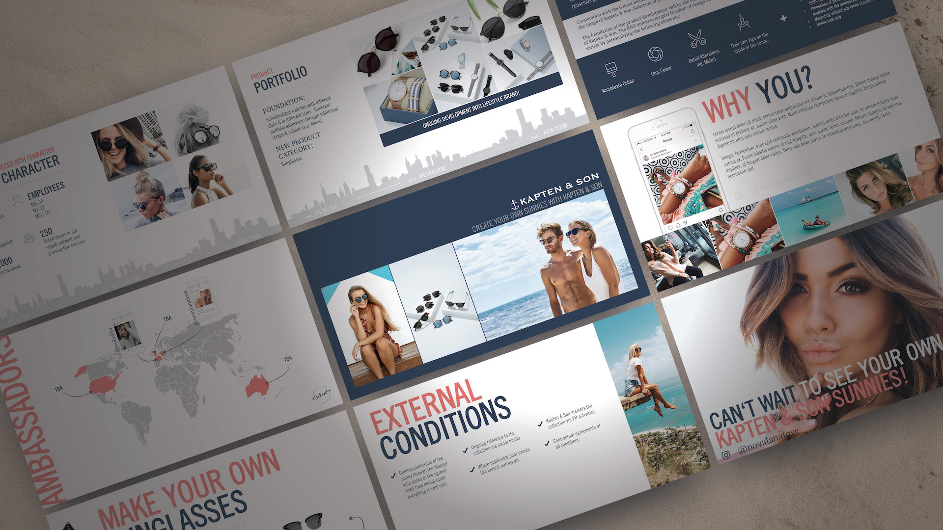
Kapten & Son already had a strong brand guide, so it made designing this series much easier. Throughout, I wanted to maintain a hint of nautical with a play between nautical blue overlays, and pearl white backdrops. I was also lifestyle photo-heavy, most of which are pieces from actual influencers wearing Kapten & Son products. I wanted influencers to see themselves in those photos, and I wanted them seeing the momentum already underway in the influencer community. Graphically, I laid out elements in a fun and engaging way, sometimes breaking rules and running large text off the slide. I also wanted to suggest a treasure map feel with dotted arrows between objects and maps that interacted with photos. Overall I'm pleased with how these turned out.
Me rocking a pair of the Fitzroy Sunnies. Kapten & Son was kind enough to ship me a pair from Germany after the project.

