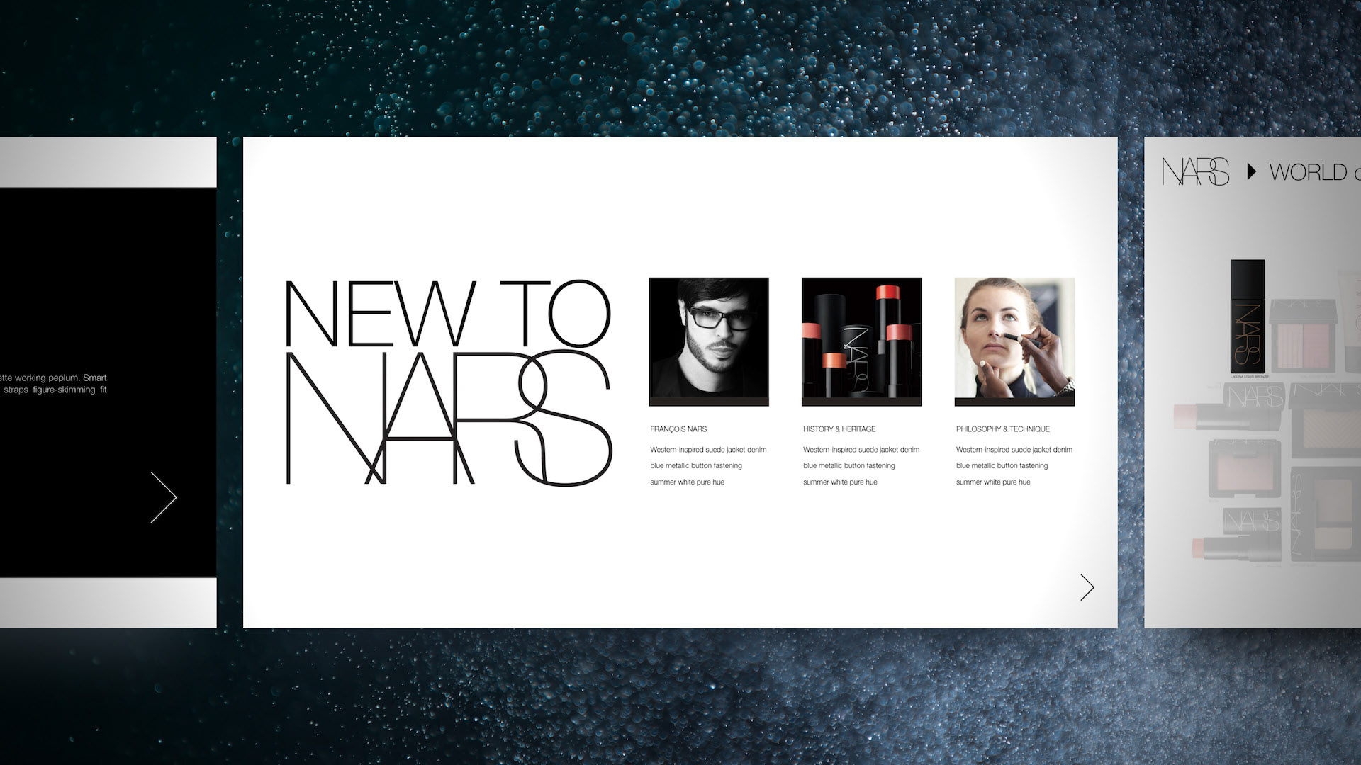
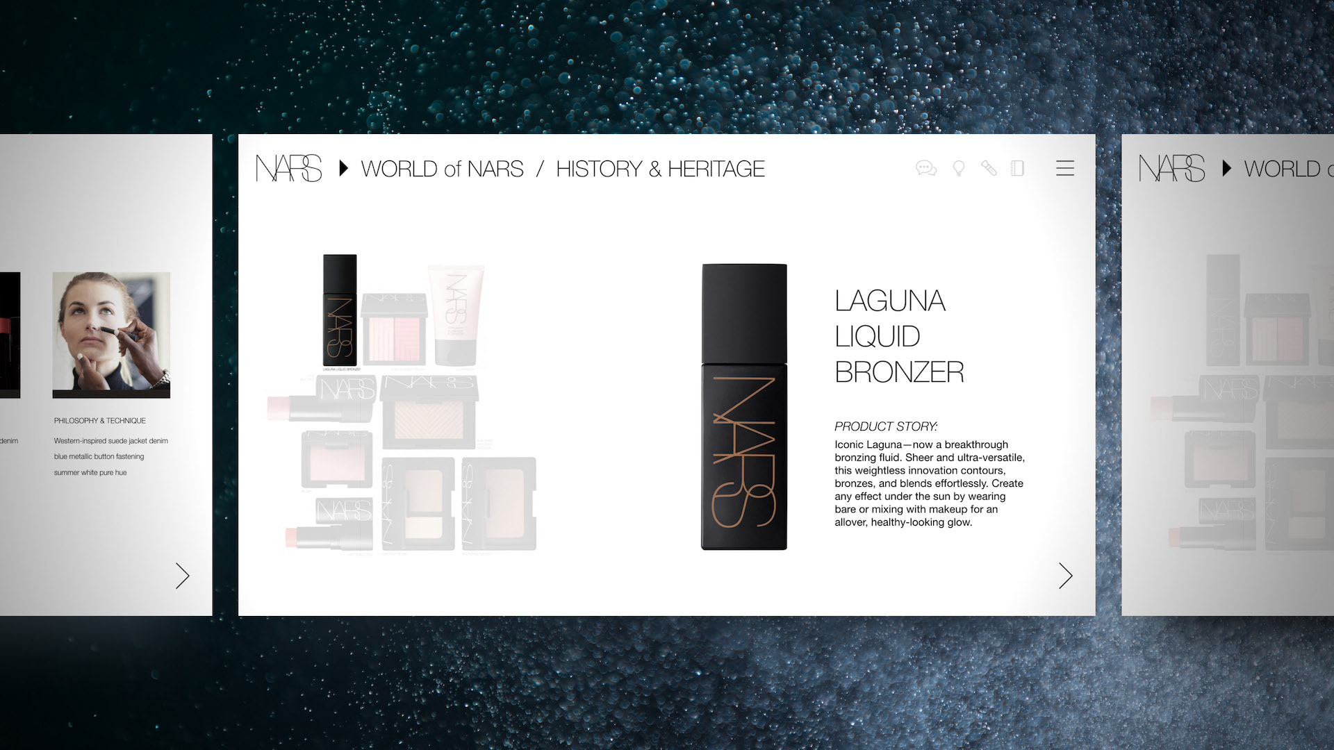
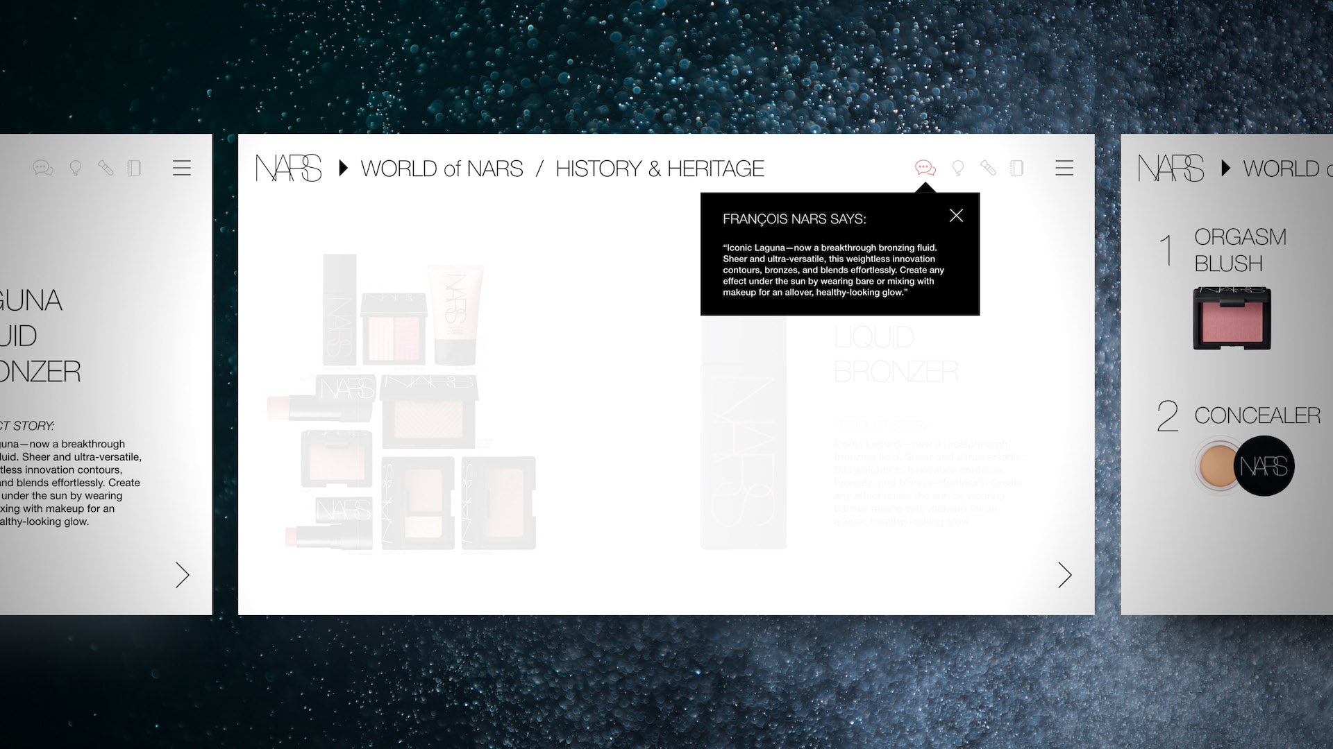
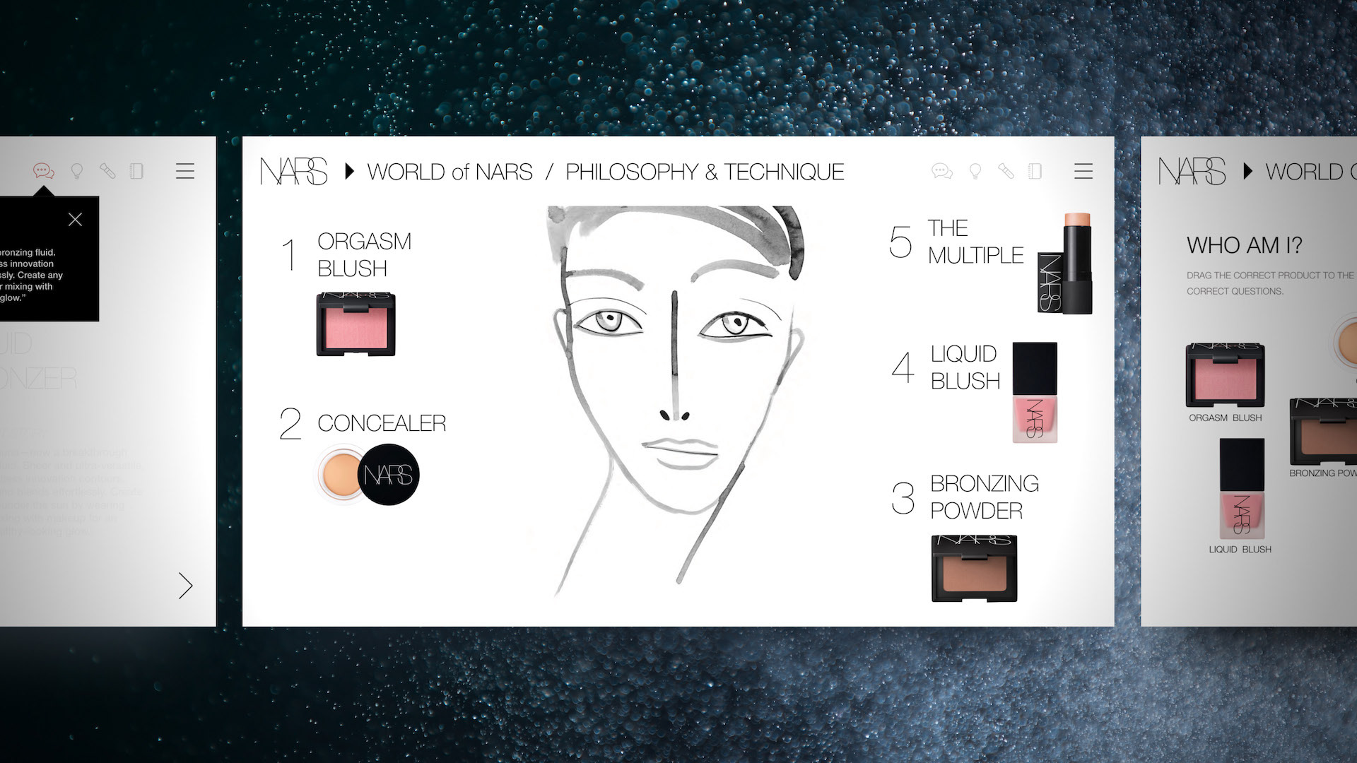
Design Commentary:
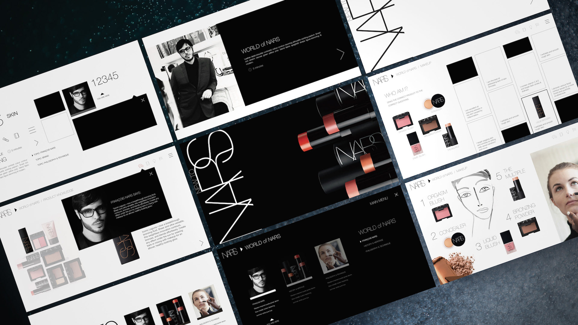
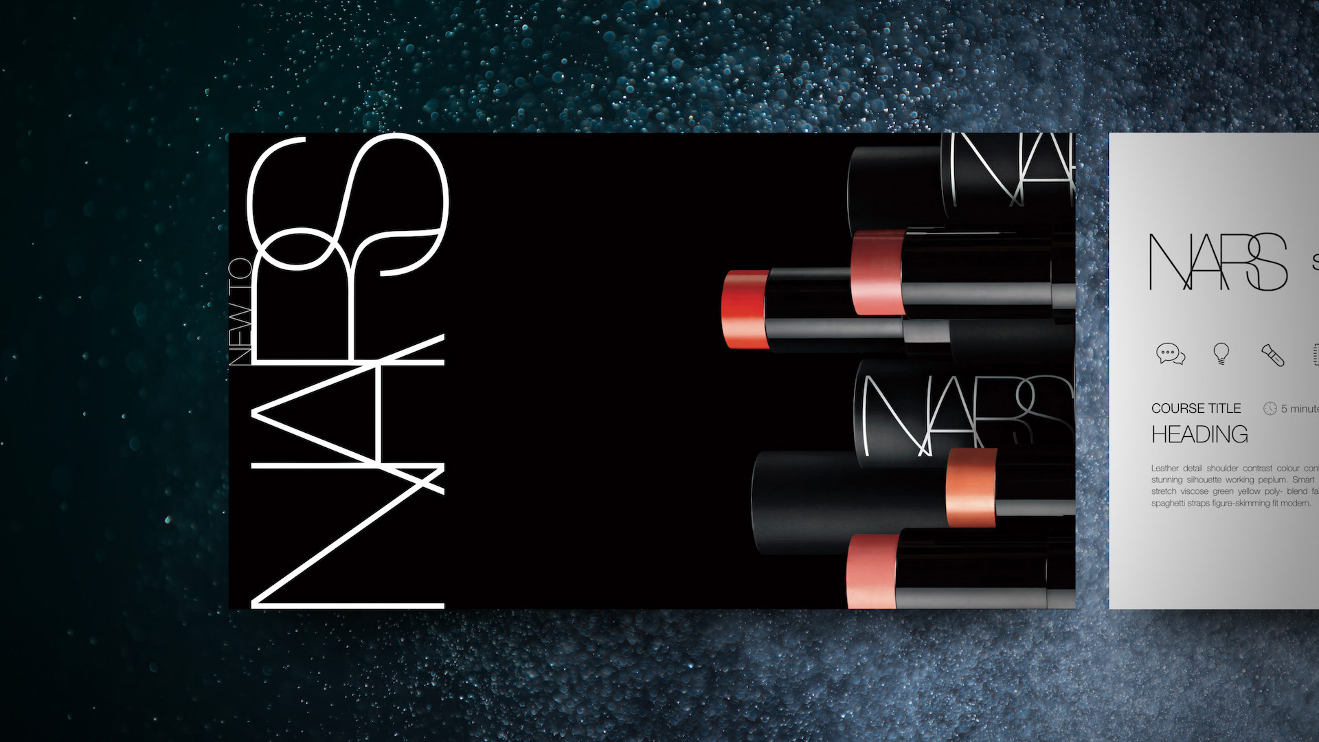
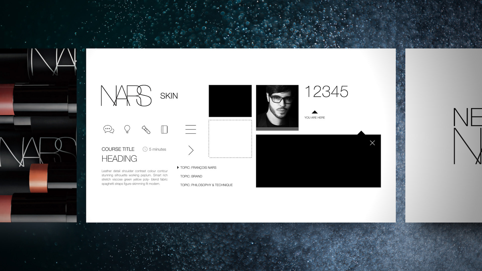
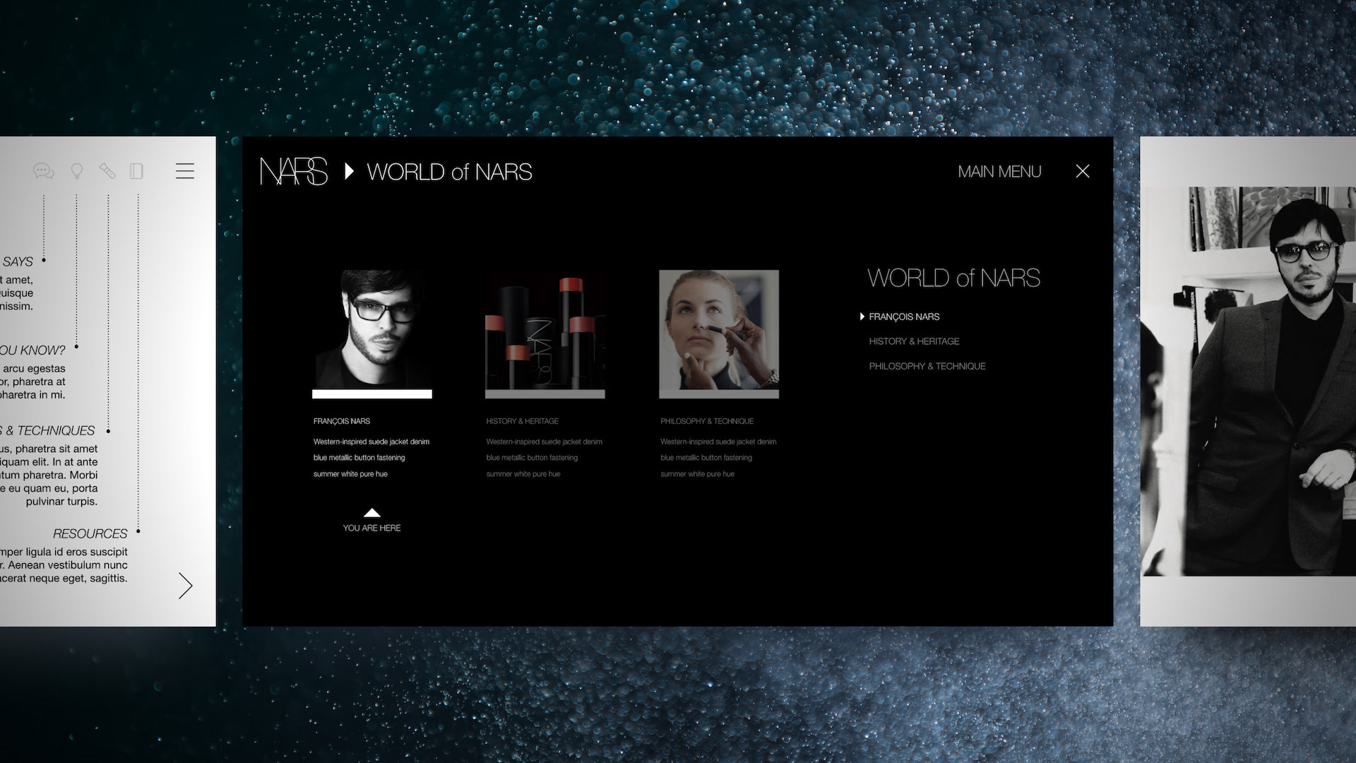
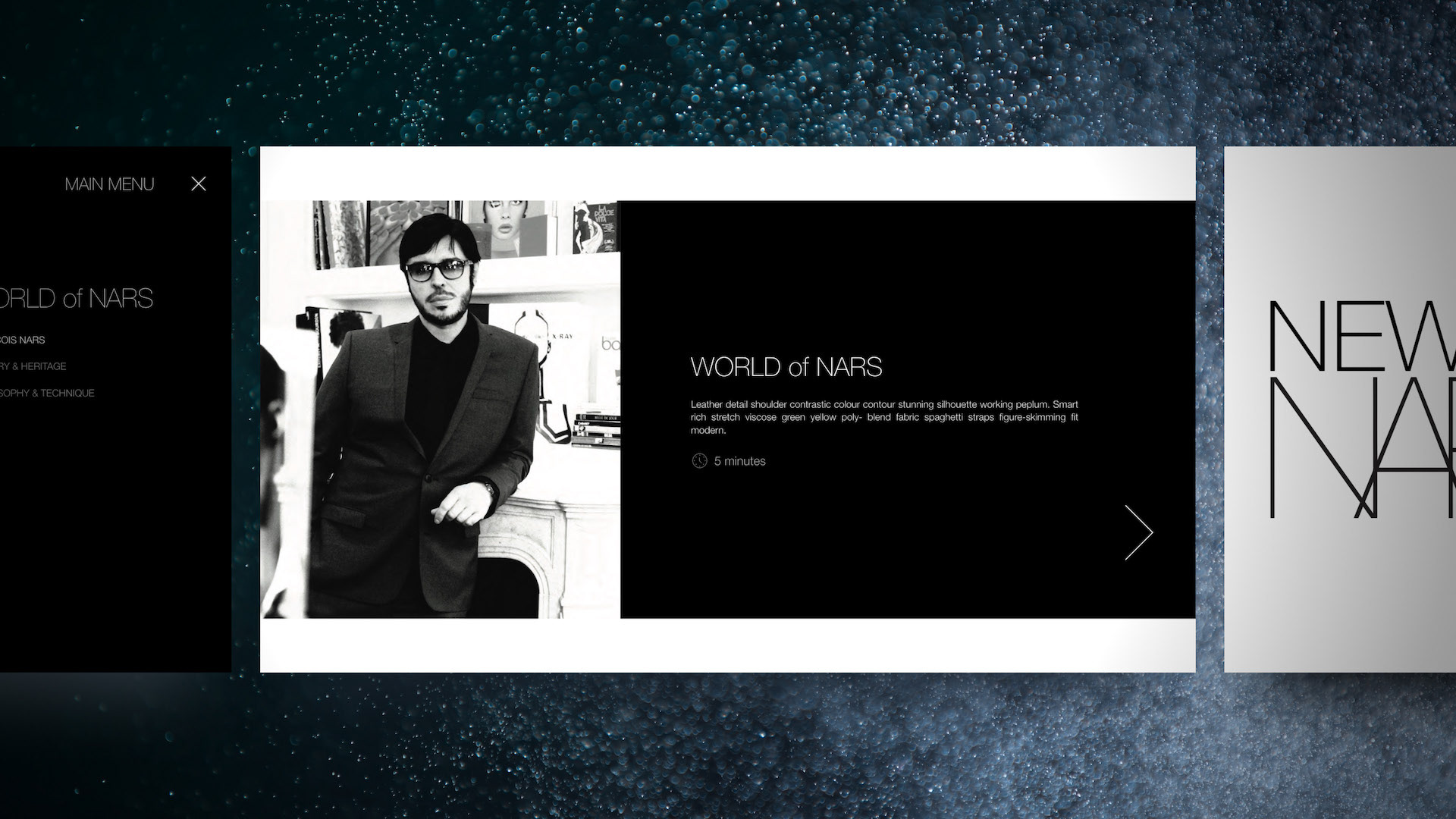
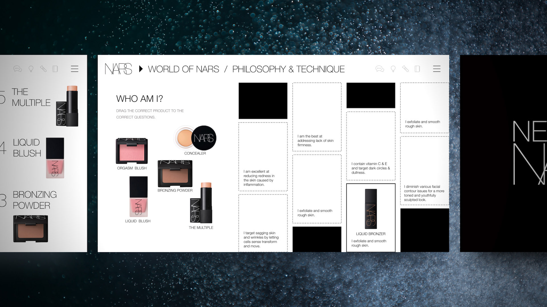
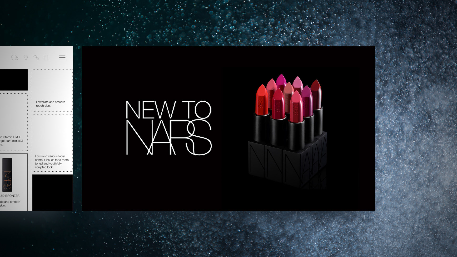
The NARS brand carried strict guidelines right down to kerning and font size for various uses so from a design standpoint, I was working under a more restricted environment than I was used to. The NARS look is very "high fashion" with sharp blacks, ultra thin all caps fonts, and lots of strong product and model visuals. I needed to capture all of this and come up with a series of course slides that would make discovering the brand fun, engaging, and highly interactive. One key design consideration was navigation. To help with navigation clarity, I kept all learning slides white backdrop, all title slides black, and I built a full screen black overlay menu with chapter blocks that would light up if the learner was in that chapter. These techniques provided visual cues to the learner where they were situated in the module.