Design Commentary:
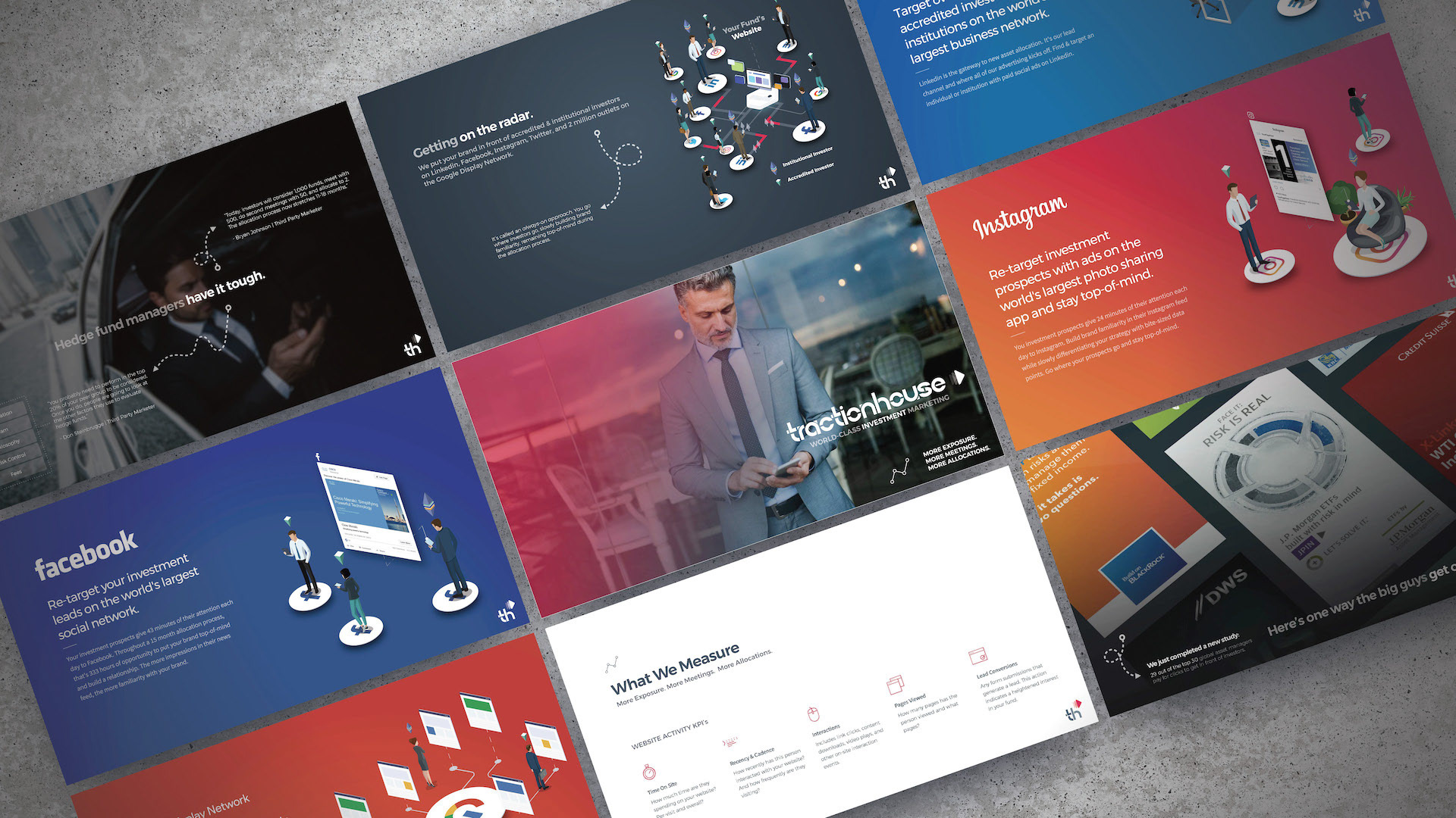
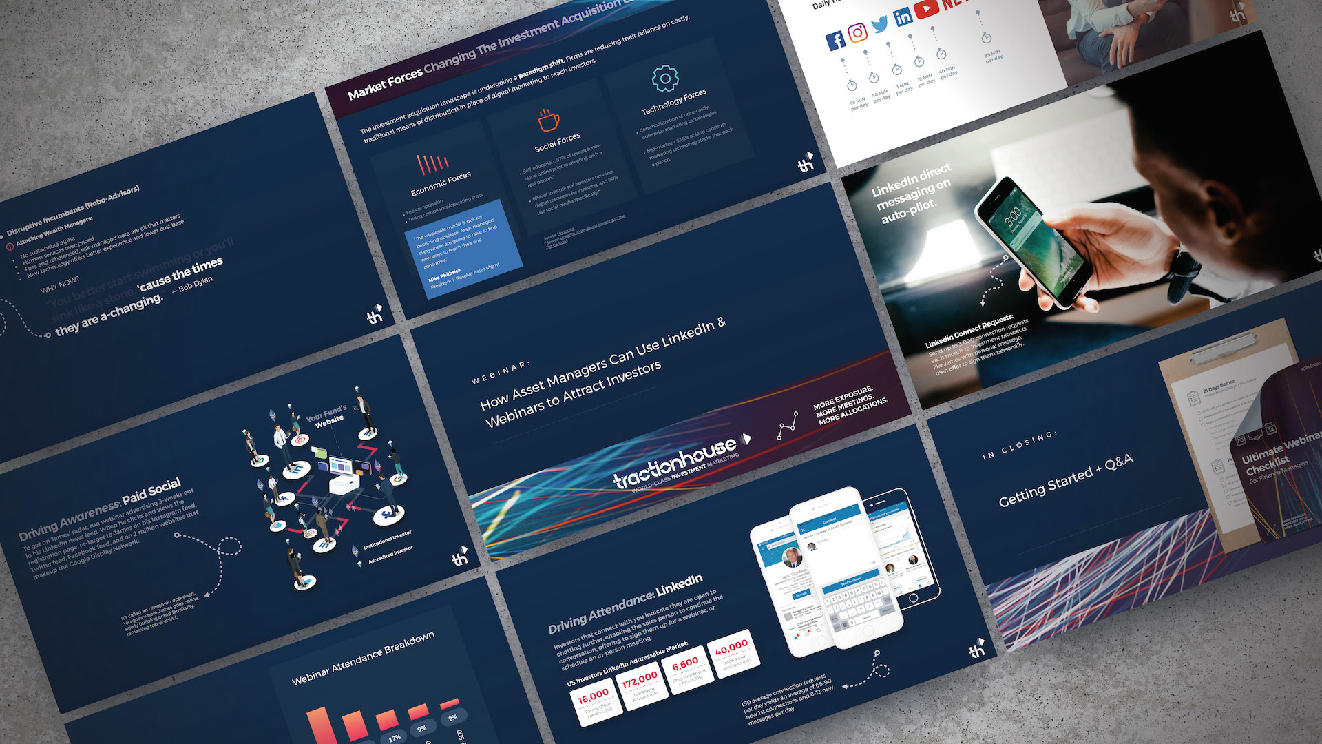
This was the original design look for the Traction House brand, in use in the first half of 2018. At this early stage we were primarily interested in this concept called "hypertargeting" which meant focusing marketing and advertising content at an extremely narrow market segment online. Visually I was seeking to achieve a big data, AI technical look, hence the node graphics and dark grey tones. The serif fonts were also used to contribute an air of sophistication and class.
