Design Commentary:
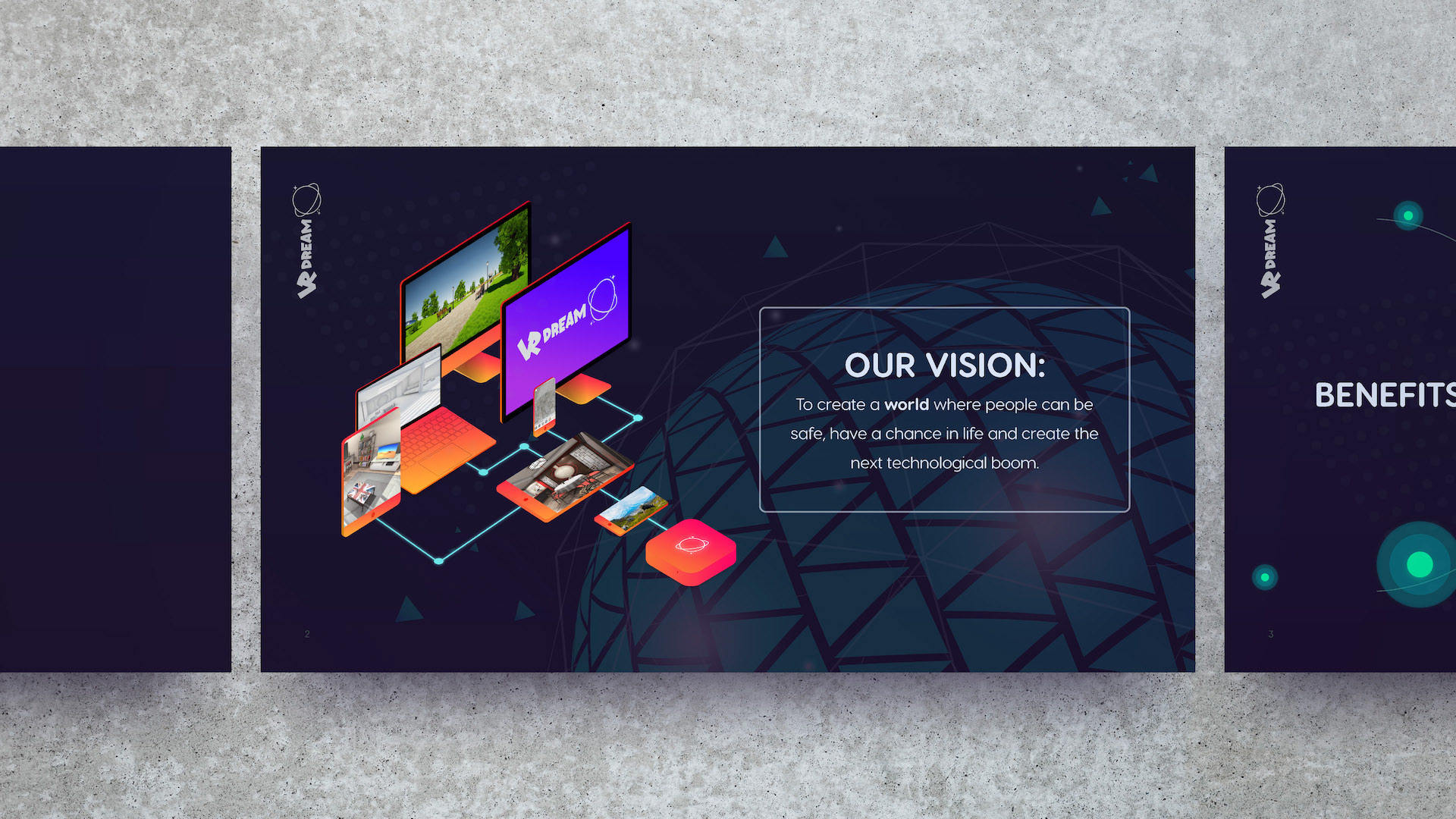
When I took on this project, I was handed just the VRDream logo and outline notes. I constructed the entire visual language from the logo itself. The logo reminded me of Looney Toons, so I opted to go with a softer font face called Visby CF Rounded. I also wanted to create a dark canvas and let the vibrant gradients pop off the page - creating a more immersive experience that I think fit well with the theme of virtual reality. Once I got the first few slides set, I was rolling. I had the look I wanted and it was just a matter of maintaining the consistency all the way to the finish line.