Design Commentary:
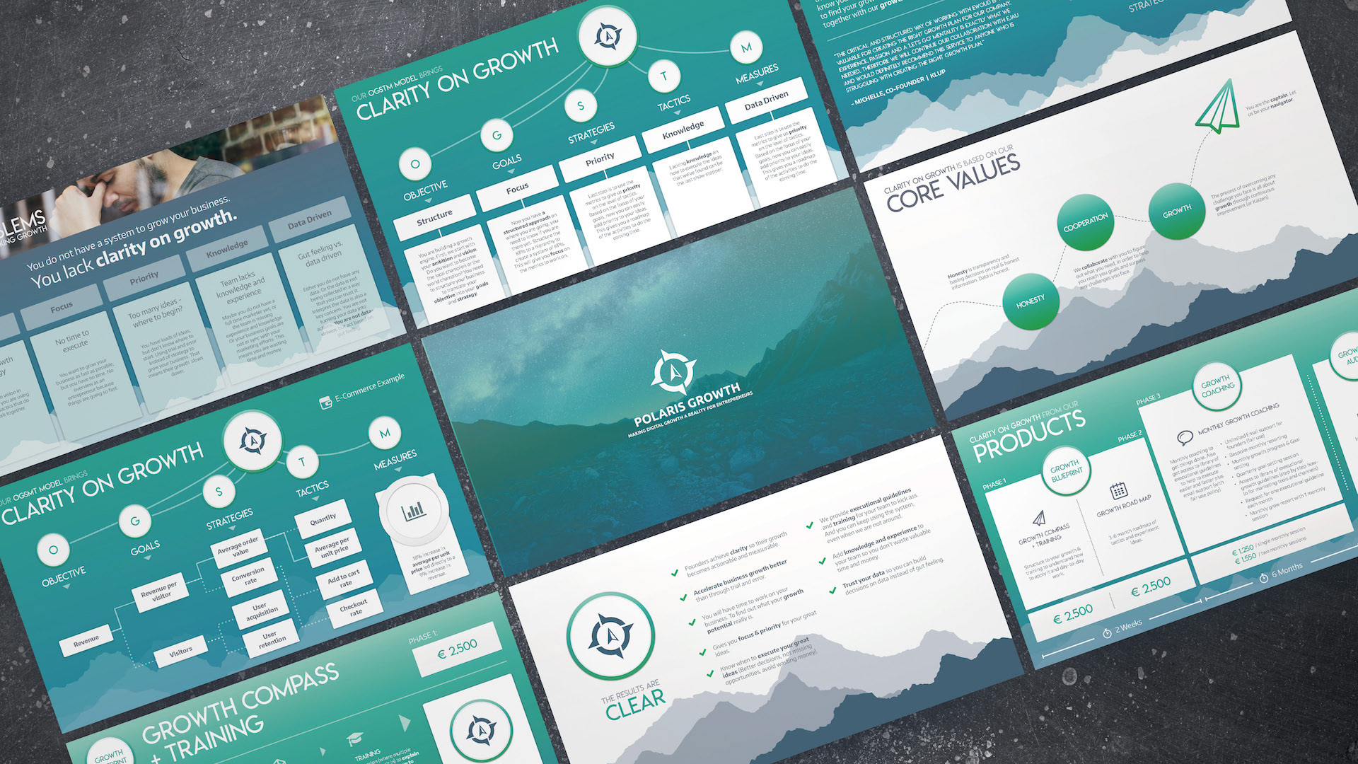
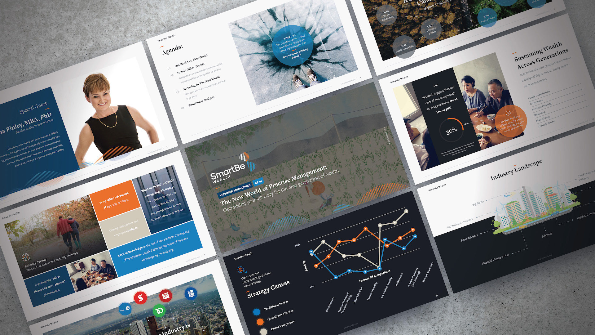
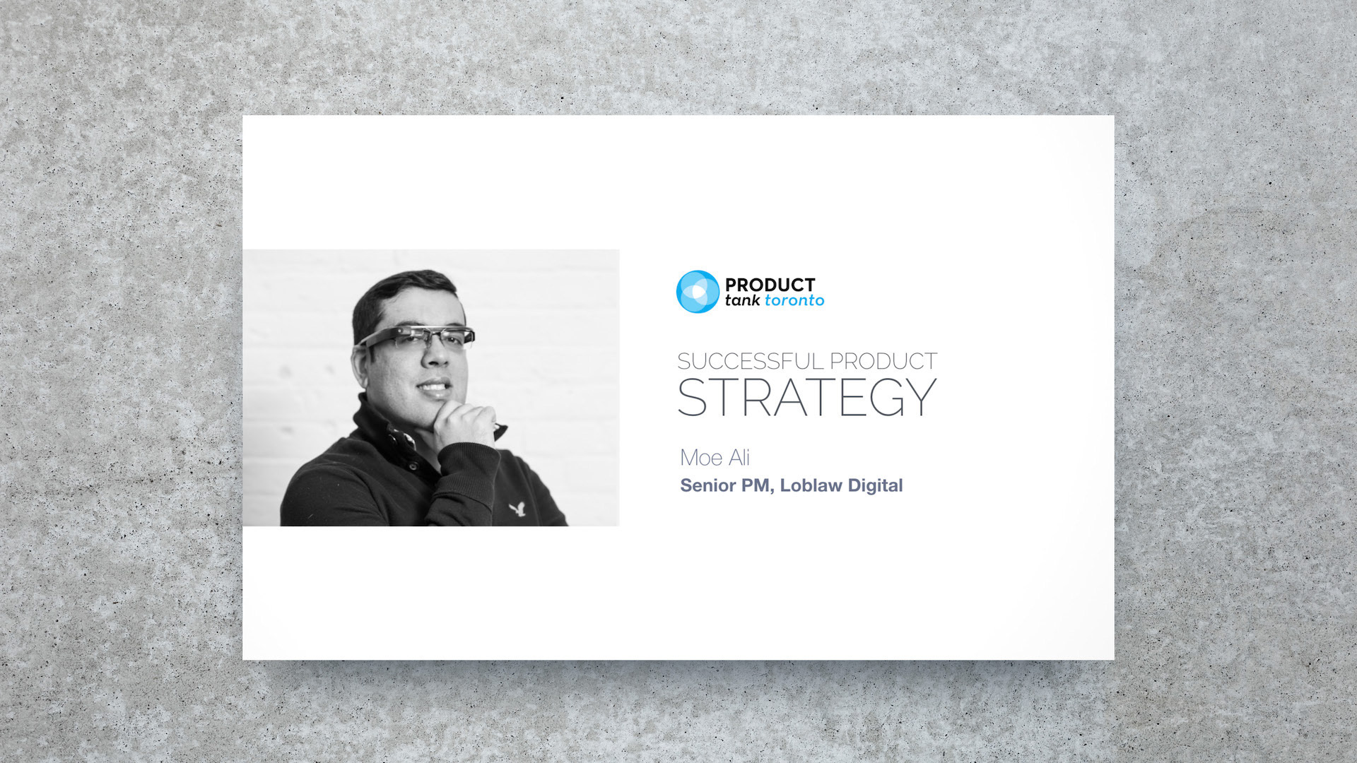
Visually, I wanted the actual presentation design to make way for the prototype visuals to occupy centre stage. I did this by using a lot of white space, and centring graphic and accompanying text elements on the page. I was also careful to not include too much information on any single slide, I'm never afraid to use up lots of slides in the name of braking up the narrative to keep each part in focus.

