
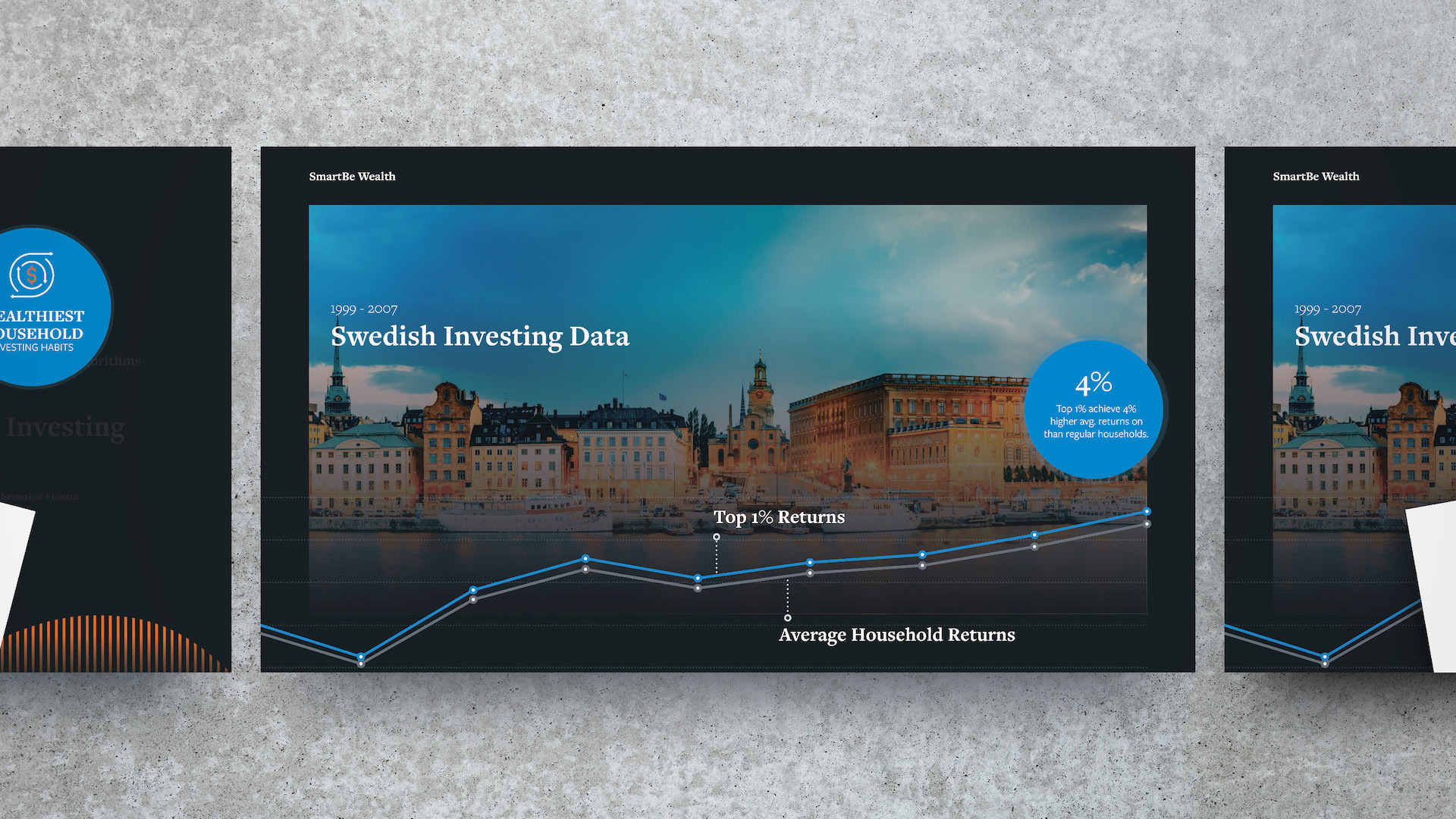
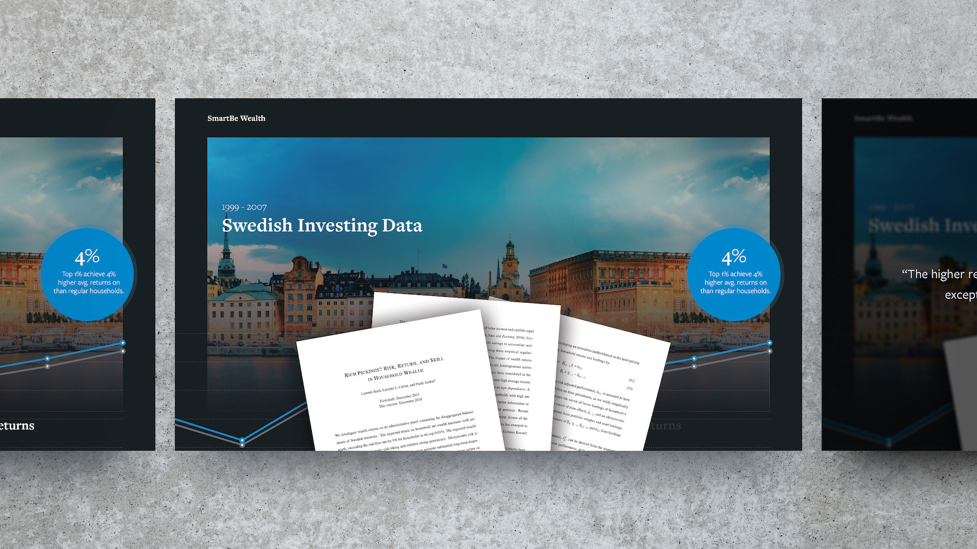
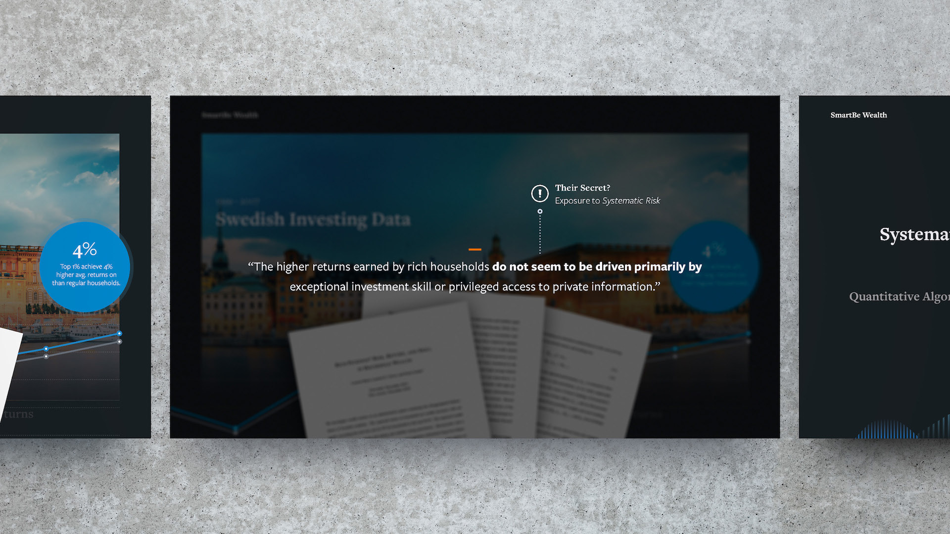
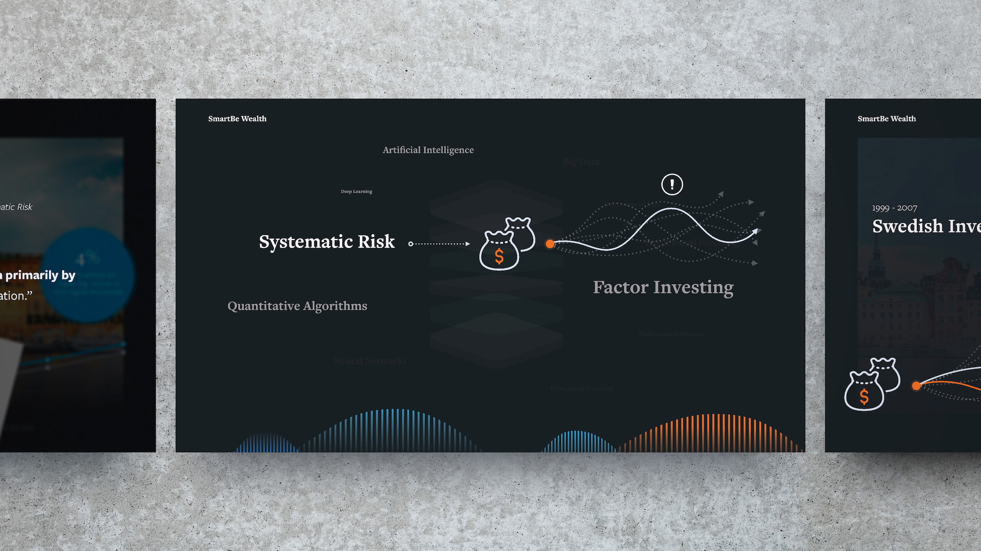
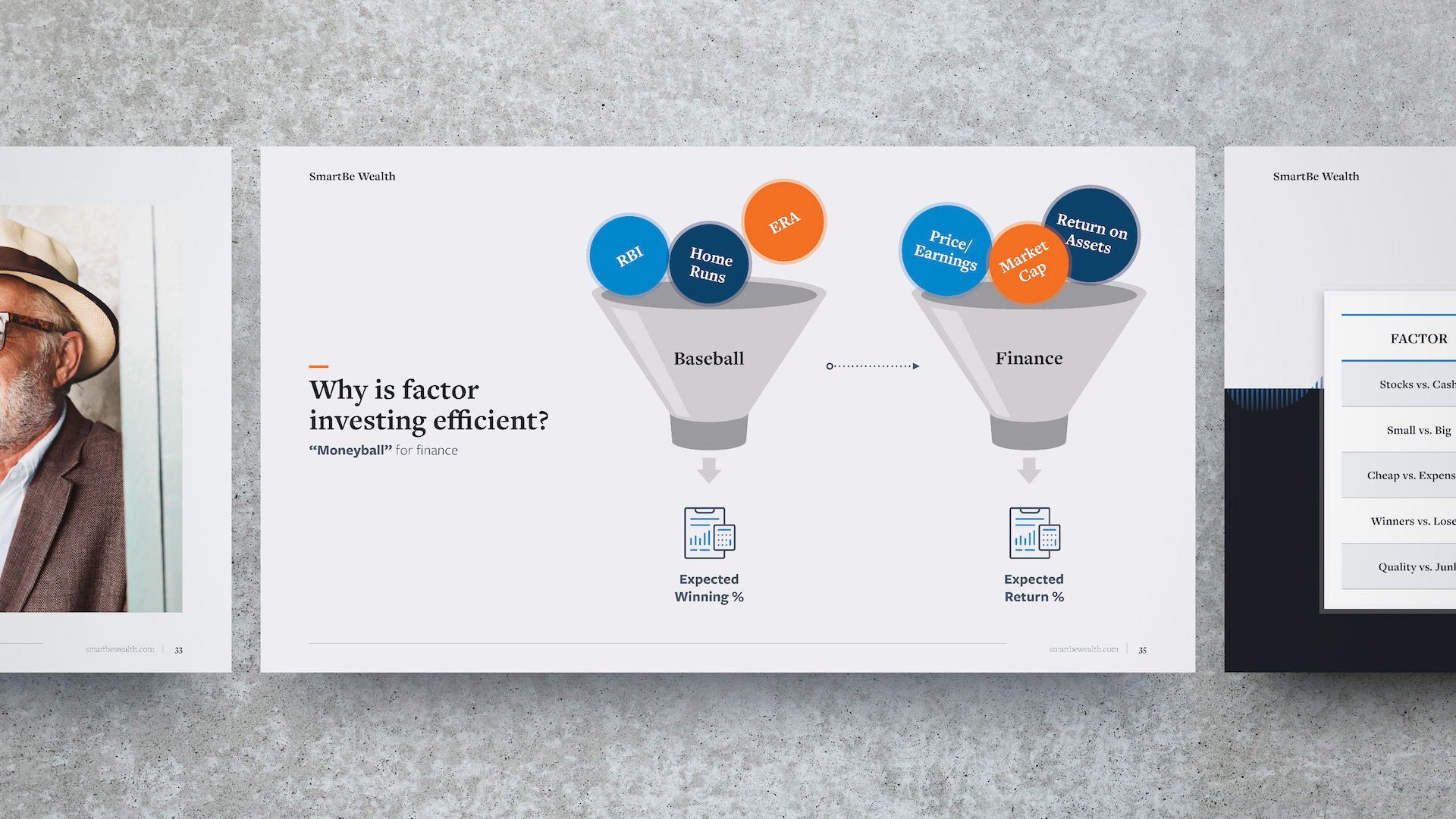
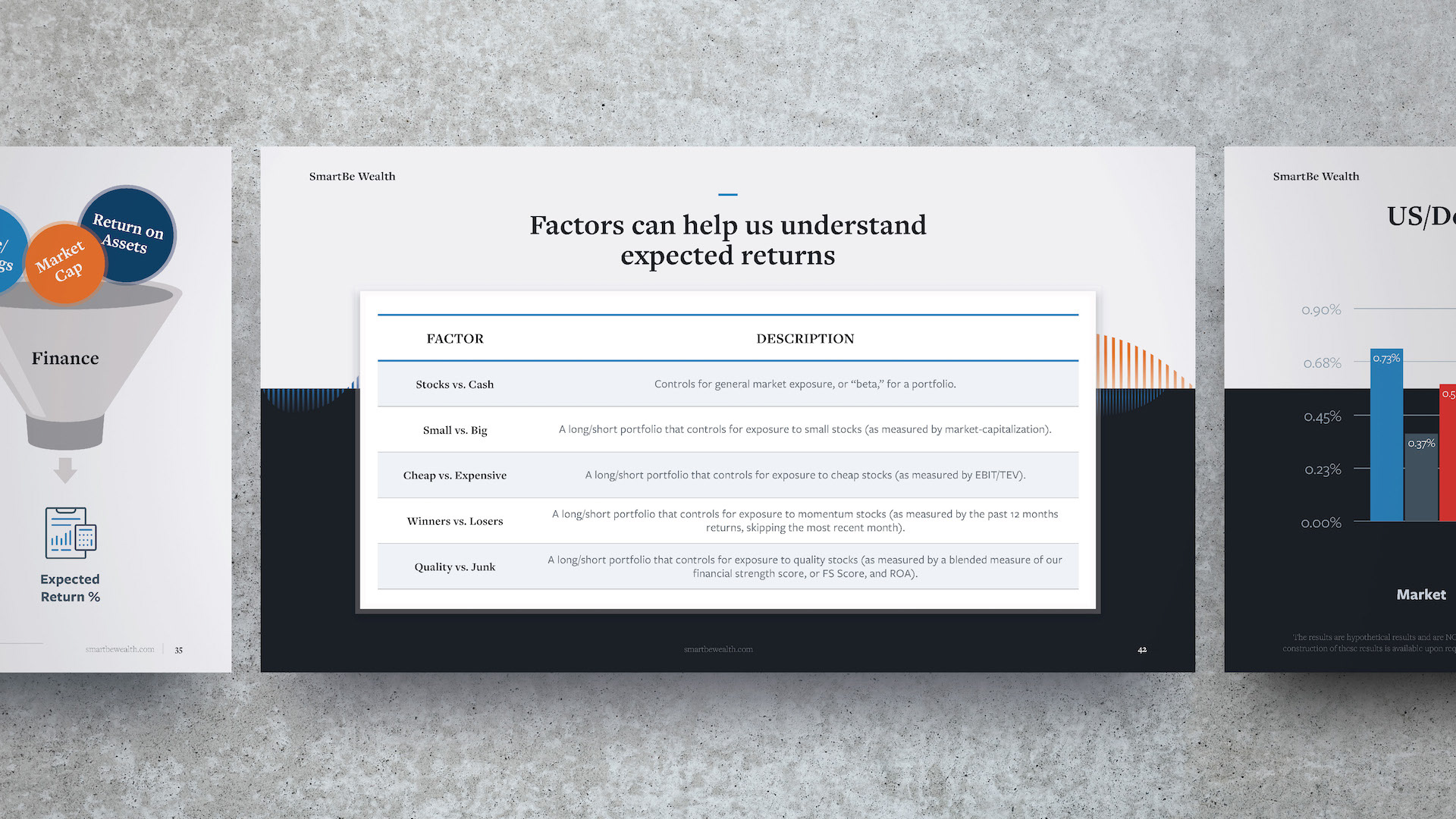
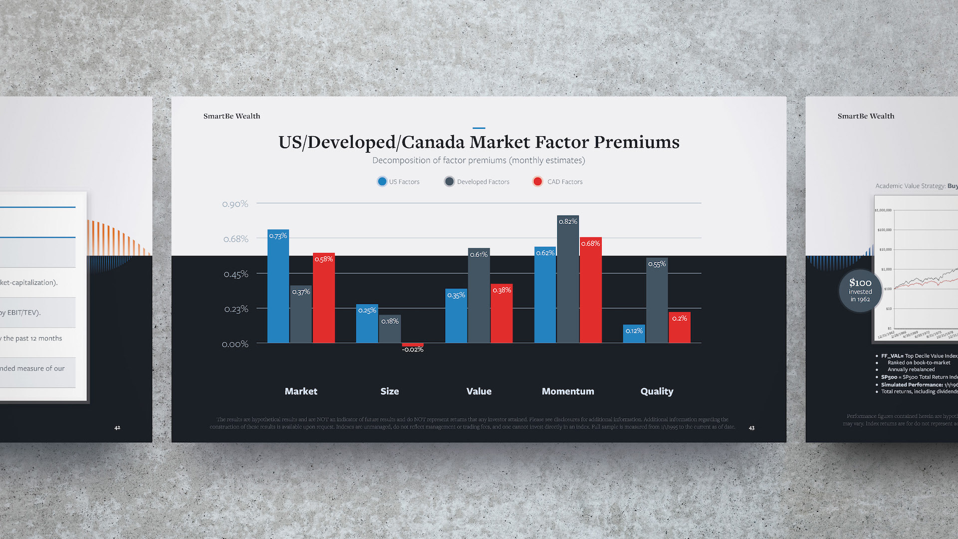
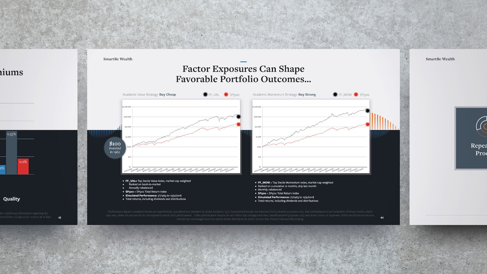

Design Commentary:
The SmartBe brand was built to steer clear of the classic cookie cutter investment manager brand look (vanilla lifestyle istock and "safe" colour schemes). SmartBe had previous invested in custom illustrations that thematically suggested attractive features of investing (risk aversion, sustainability etc). When designing this presentation series, I wanted to capture the friendly, smart, approachable brand roots SmartBe was planting. I accomplished this primarily with gentle fades, simplistic layouts and an abundance of whitespace.