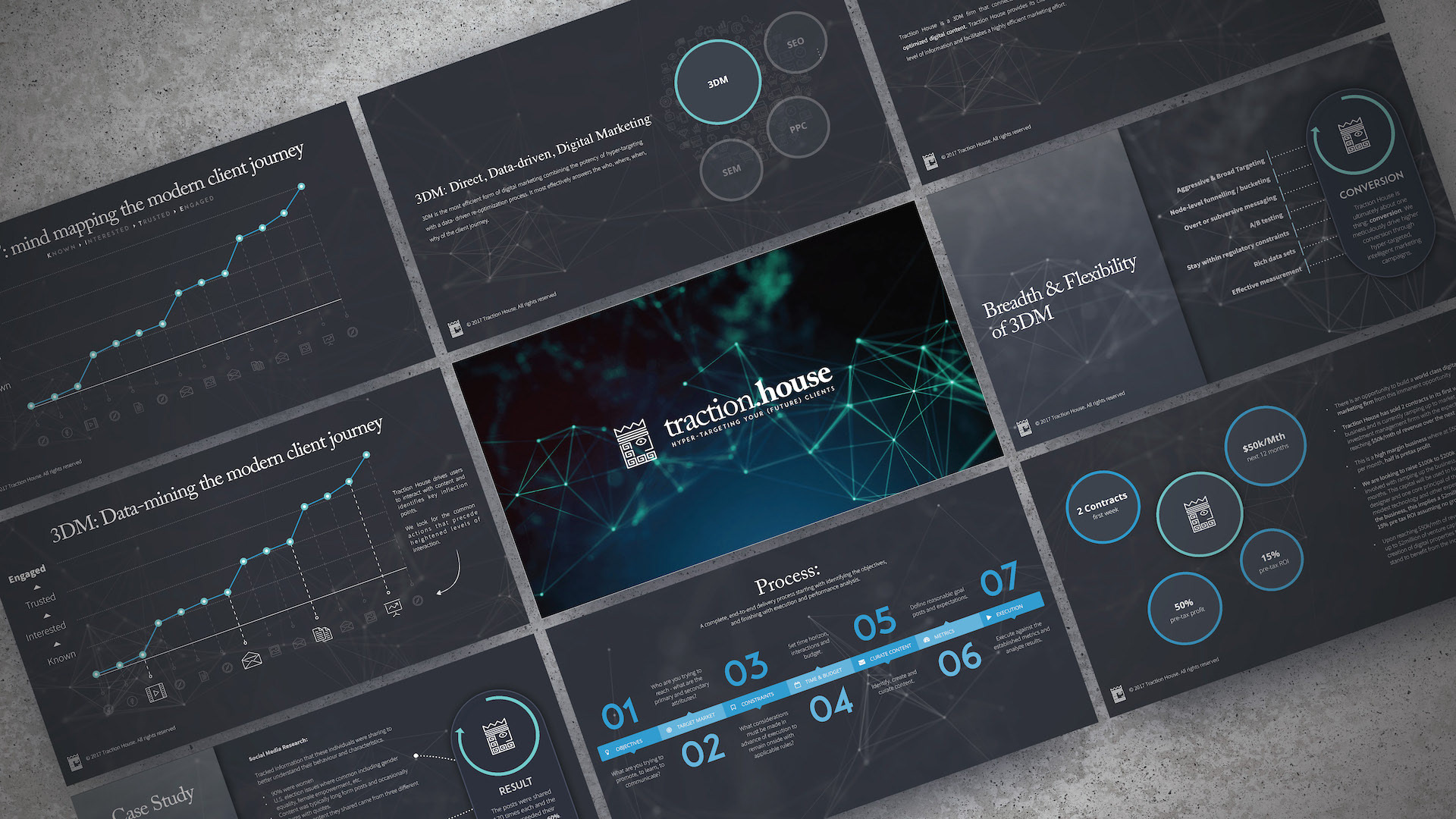
Design Commentary:
For this deck I went with clean, minimalistic look. The turquoise highlight is the only hint of colour in the entire deck, everything else is a blend of charcoal greys and off-whites. Instead of directing attention with colour, I direct it with objects. For example, the "Our Focus" slide leverages origami birds and a mountain illustration to communicate the preferred area of investment for the firm.
