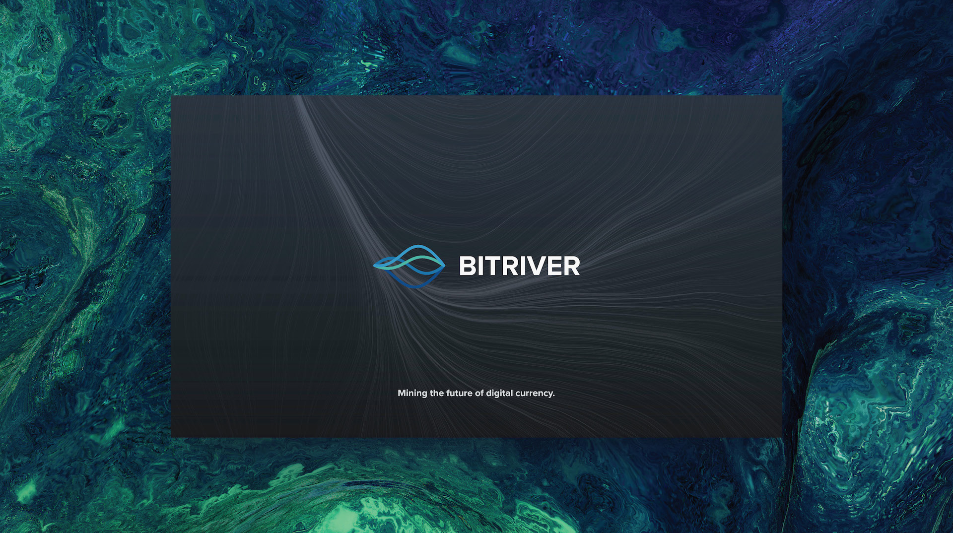
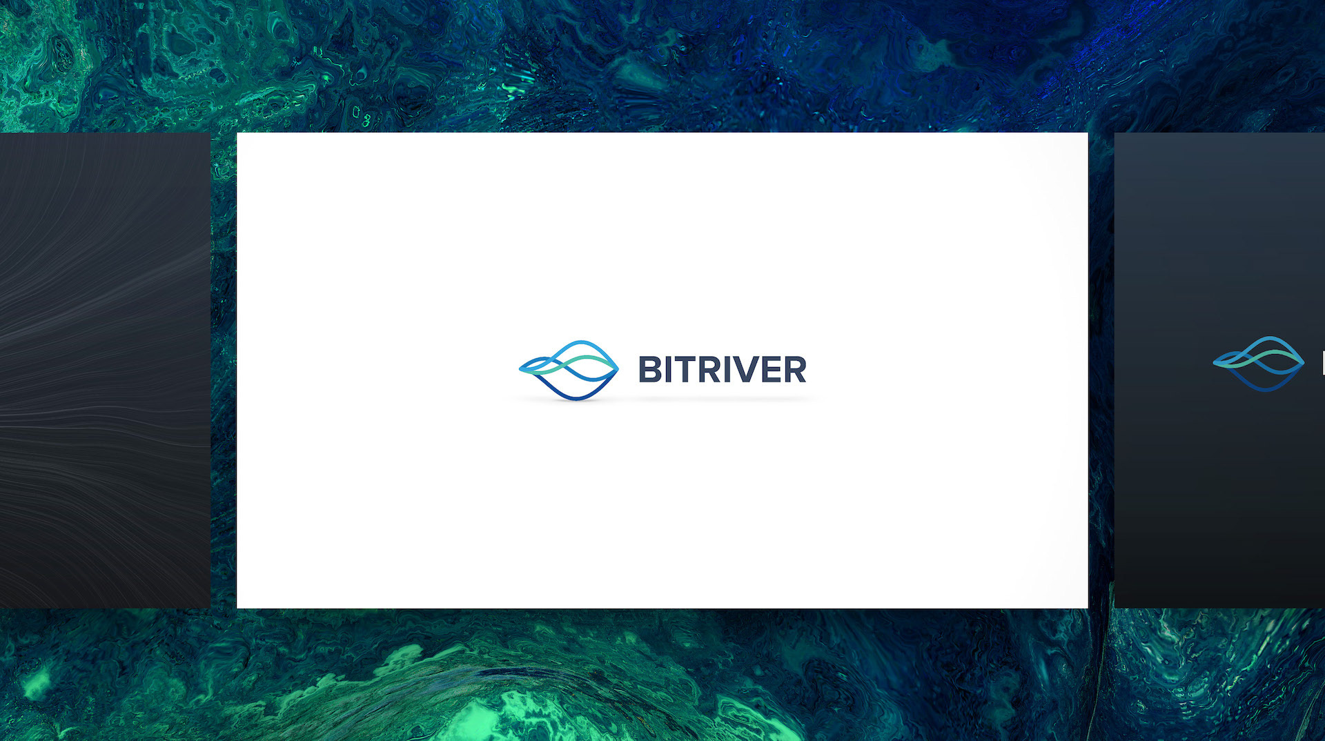
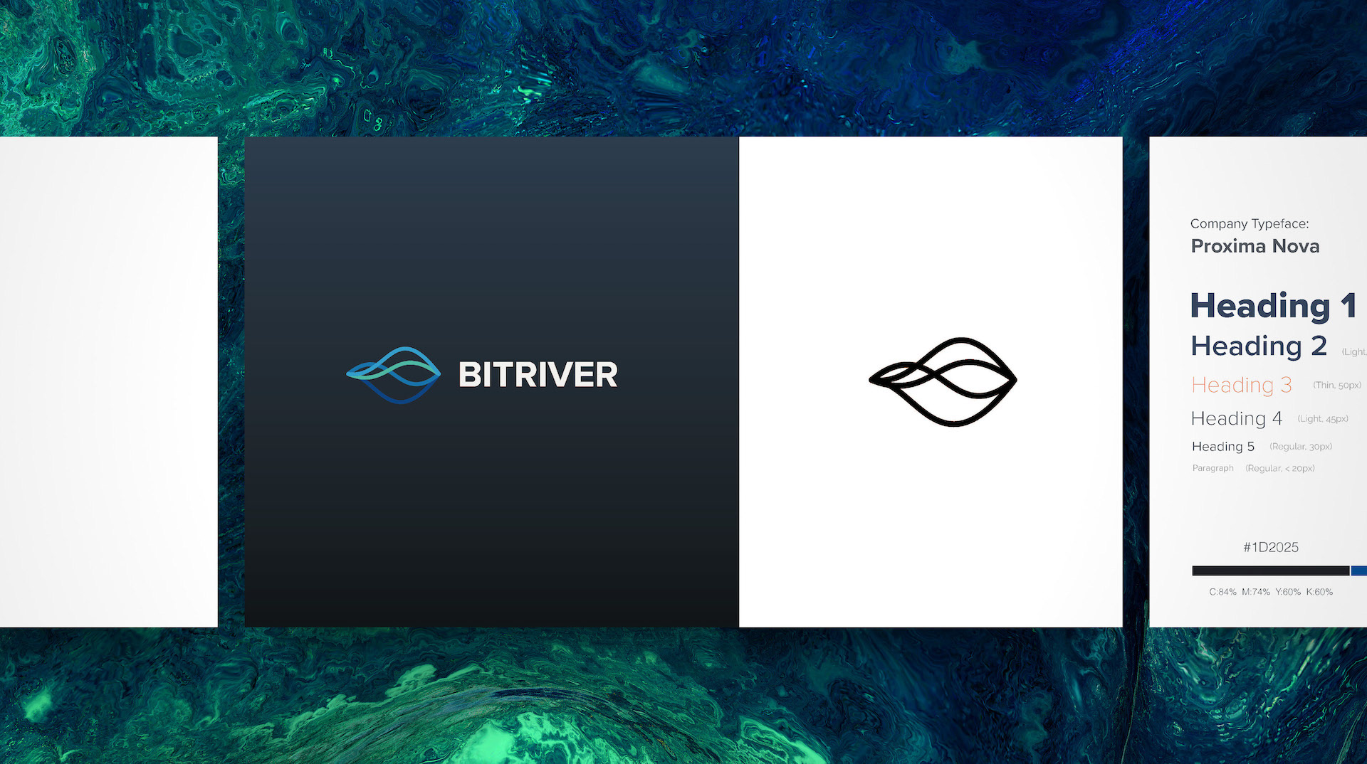
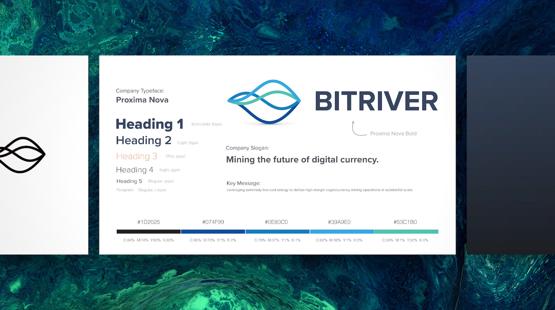
Design Commentary:
This was a bitcoin mining company, and its name, "Bit River" prompted me to go with a water/river motif both in the shape and colour of the logo itself and the accompanying background textures. This created a "light on the feet" feel which represented the companies nimble, high growth attitude toward the Bitcoin mining industry. But I also wanted to bring home a sense of serious intentionality to the brand, something that suggested competence and "a force to be reckon with" - so I went with a wide sans serif Proxima Nova logo font.